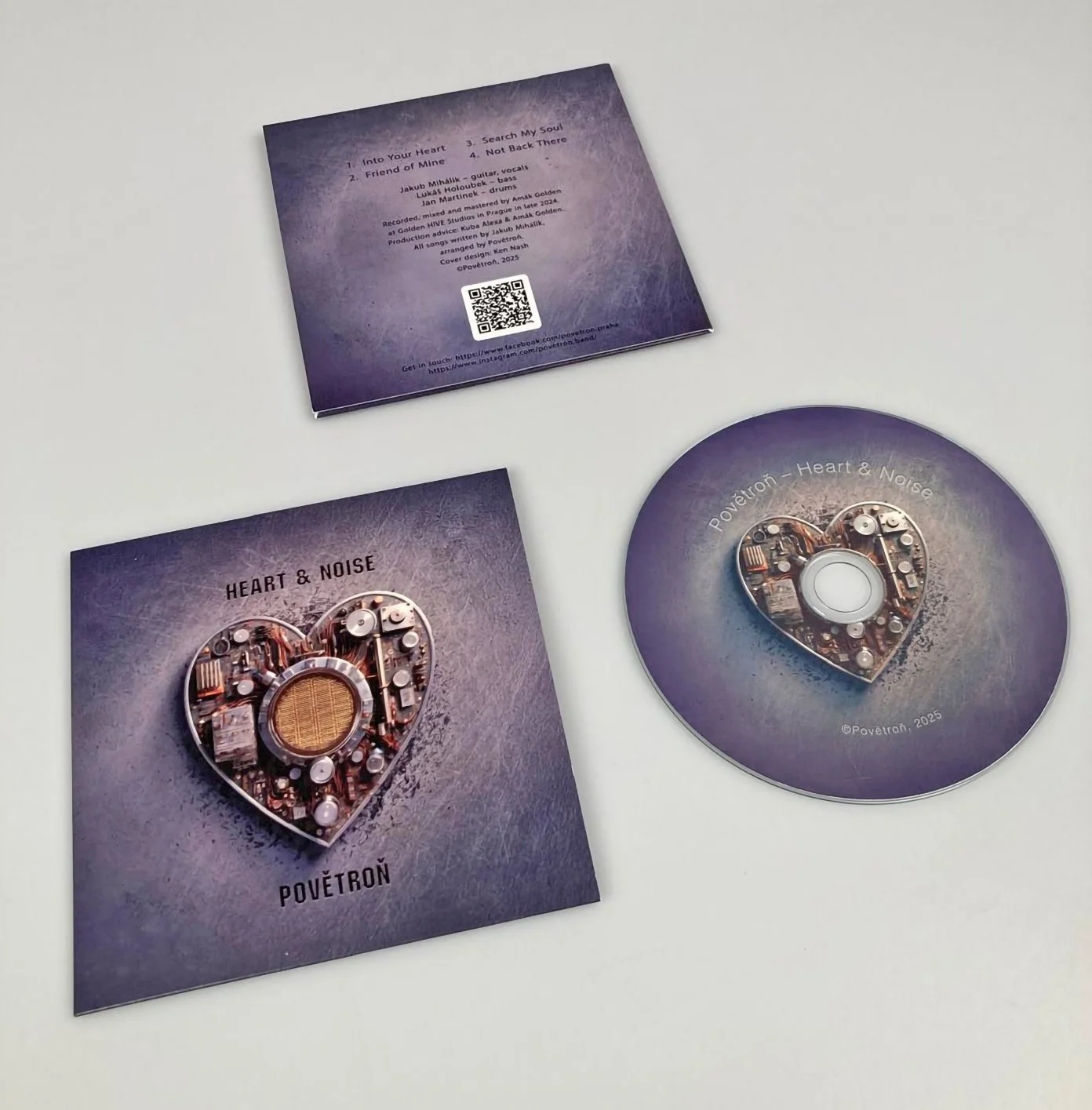
There's something wonderfully stubborn about a band insisting on physical CDs in 2026. When Czech music group Povětroň reached out about designing the packaging for their new album Heart & Noise, I was charmed by their commitment to giving listeners something tangible to hold.
CD package design for Povětroň
The project grew beyond just CD packaging — the illustration work and design became the foundation for all their promotional materials and social media graphics. The breakthrough came with a heart/radio motif that captures the tension between emotion and transmission, between what we feel and how we broadcast those feelings into the world.
Here's what the band had to say:
"We really enjoyed working with Ken on this album design and it's fair to say that he helped us move our thinking about the design, and our EP more generally, forward, while at the same time taking seriously our ideas. We were delighted with the result and might use the main heart/radio motif that Ken came up with on future occasions."
There's something particularly satisfying when a design outlives its initial purpose — when it becomes part of a band's ongoing visual identity rather than just a one-off project.
Curious what Heart & Noise sounds like? Check out their music at here .
